Your guide to stock trading chart patterns
Knowing your pennants from your cup and handles is vital if you want to succeed in trading. Stock trading chart patterns, such as the aforementioned, can help give traders a competitive advantage, but only if they know what to look for!
If you know what trends and movements to look for - what patterns form - you’ll gain insight for your technical analysis that lowers stock trading risks. In this article, we’ll go over the most common trading chart patterns and how to recognize them.
What are stock trading chart patterns?
Before we dive into the most common chart patterns, let's go over a few basics. Stock price data is constantly updated, and successful market professionals understand how to use it to their advantage by making predictions on what could happen to the valuation.
The charts show the value of a stock and how it changes during a specific period. Trading charts can display both real-time market data and historical data and are shown in a variety of data visualizations, such as candlestick charts, bar charts, or line charts.
There are many different types of trading chart patterns. Prices can change their trend direction (this is called a reversal pattern), or they can continue to follow the pattern they’re already on (also known as a continuation pattern). Each movement results in a shape, and sometimes you can flag them in time to make a decision based on the trend).
[caption id="attachment_1777" align="alignnone" width="2560"]
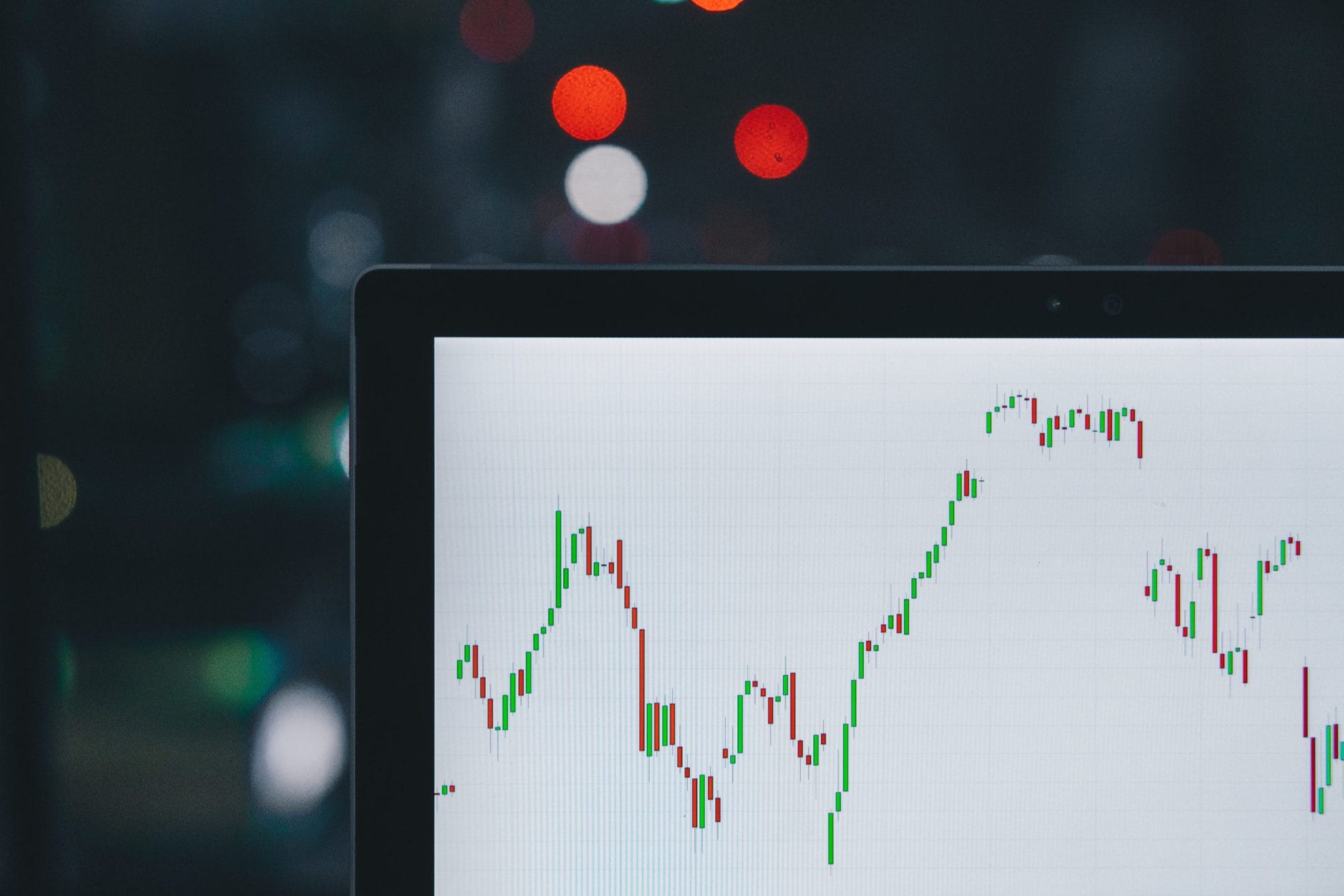
Example of a chart displaying stock prices in candlesticks over time[/caption]
Are you interested in getting access to affordable and reliable real-time data? Check out our article on the top 5 benefits of using real-time market data or learn more about United Fintech’s real-time data product.
How to recognize stock trading chart patterns
We’ve compiled a list of the most common and recognizable trading chart patterns you should know when using technical analysis to trade the financial market.
Pennants
The pennant pattern is a continuation pattern. It has a flag-like shape that is created when a clear breakout follows a consolidation.
[caption id="attachment_1770" align="alignnone" width="2560"]
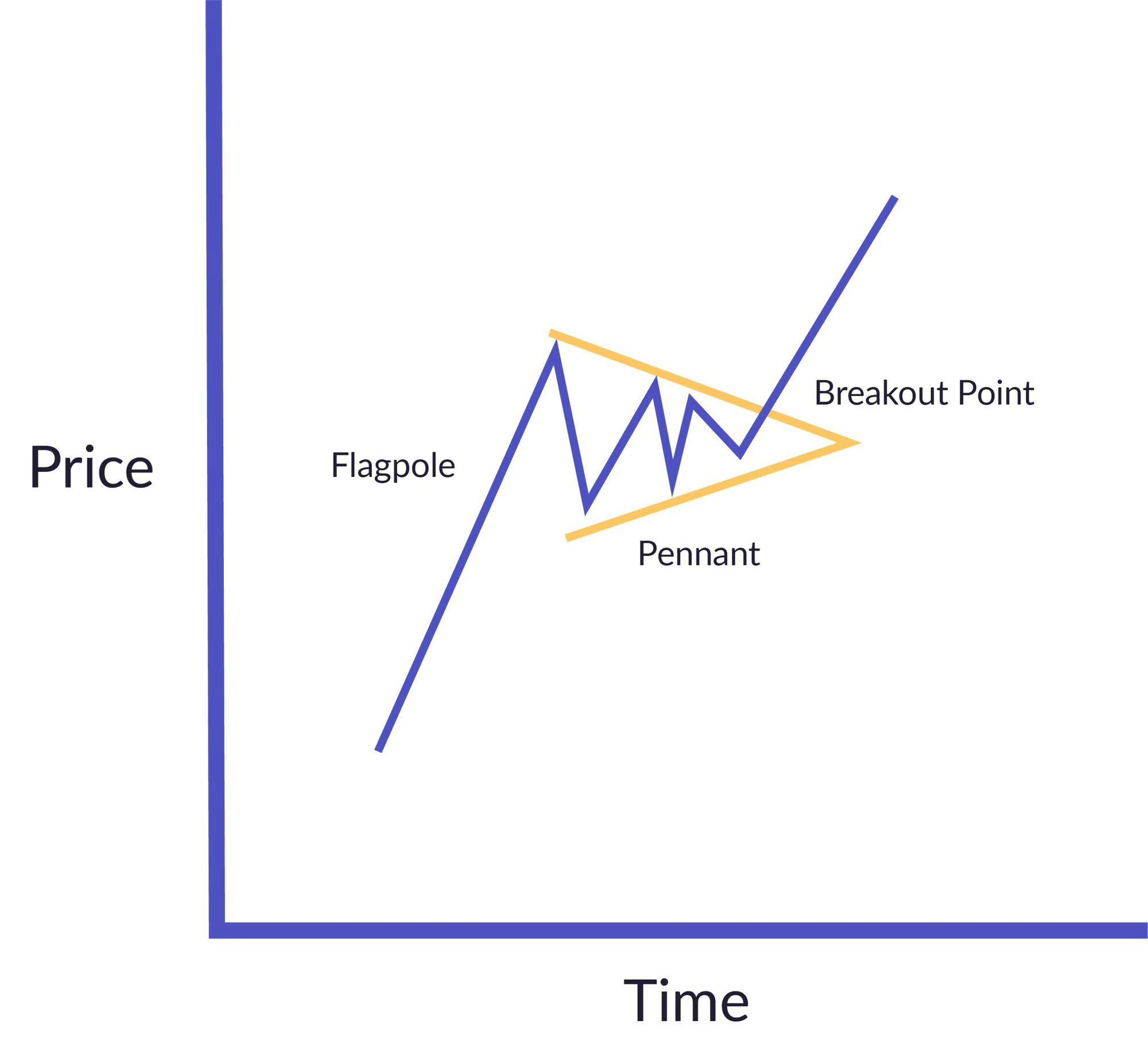
Example of a pennant pattern[/caption]
When analyzing a pennant pattern, it’s important to look at the volume within the pennant. Because the indicator for the pattern is bearish, the consolidation period needs to be at a lower volume, and the breakout has to be at a higher volume.
Flags
While pennants are bearish, flags can be either bearish or bullish and are often more subtle. The trend lines drawn over the consolidation area are parallel and attached to a flagpole.
Simply put, a flag pattern shows an abrupt trend reversal after a consolidation period. The low point of a flag shouldn’t be higher than the middle of the connected flagpole.
[caption id="attachment_1769" align="alignnone" width="2560"]
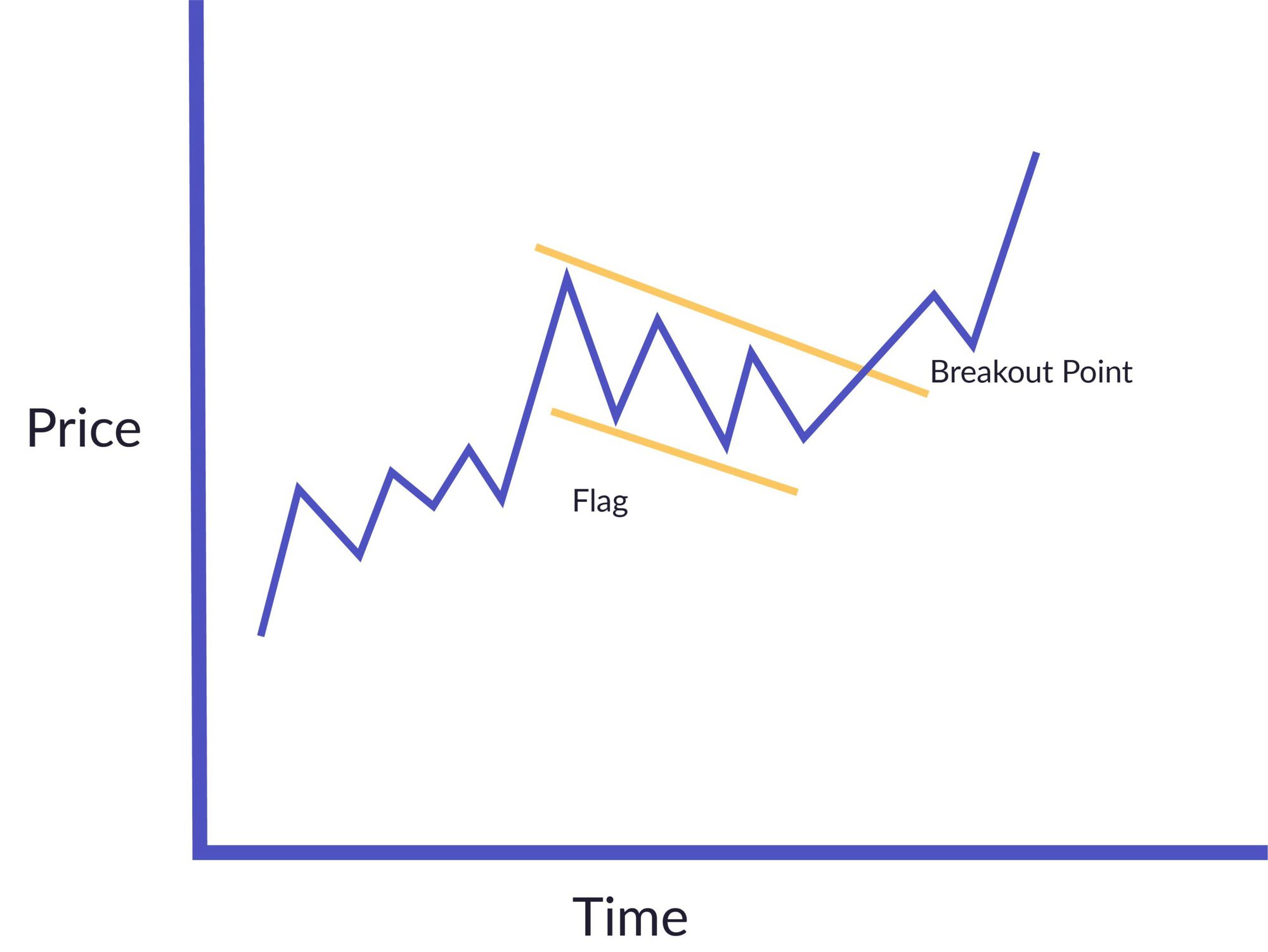
Example of a flag pattern[/caption]
Traders can use breakout points and stop-loss prices to follow the pattern and decide their ideal profit target. Depending on how much risk they’re willing to take, the profit target will vary.
Triangles
Triangles occur in several shapes and sizes. They can be ascending, descending, and symmetrical.
Ascending triangles
An ascending triangle is a bullish pattern. The upper line is horizontal and drawn along the highest values. The second line of the triangle is a trend line drawn along the lower values and has an increasing slope.
[caption id="attachment_1771" align="alignnone" width="2000"]
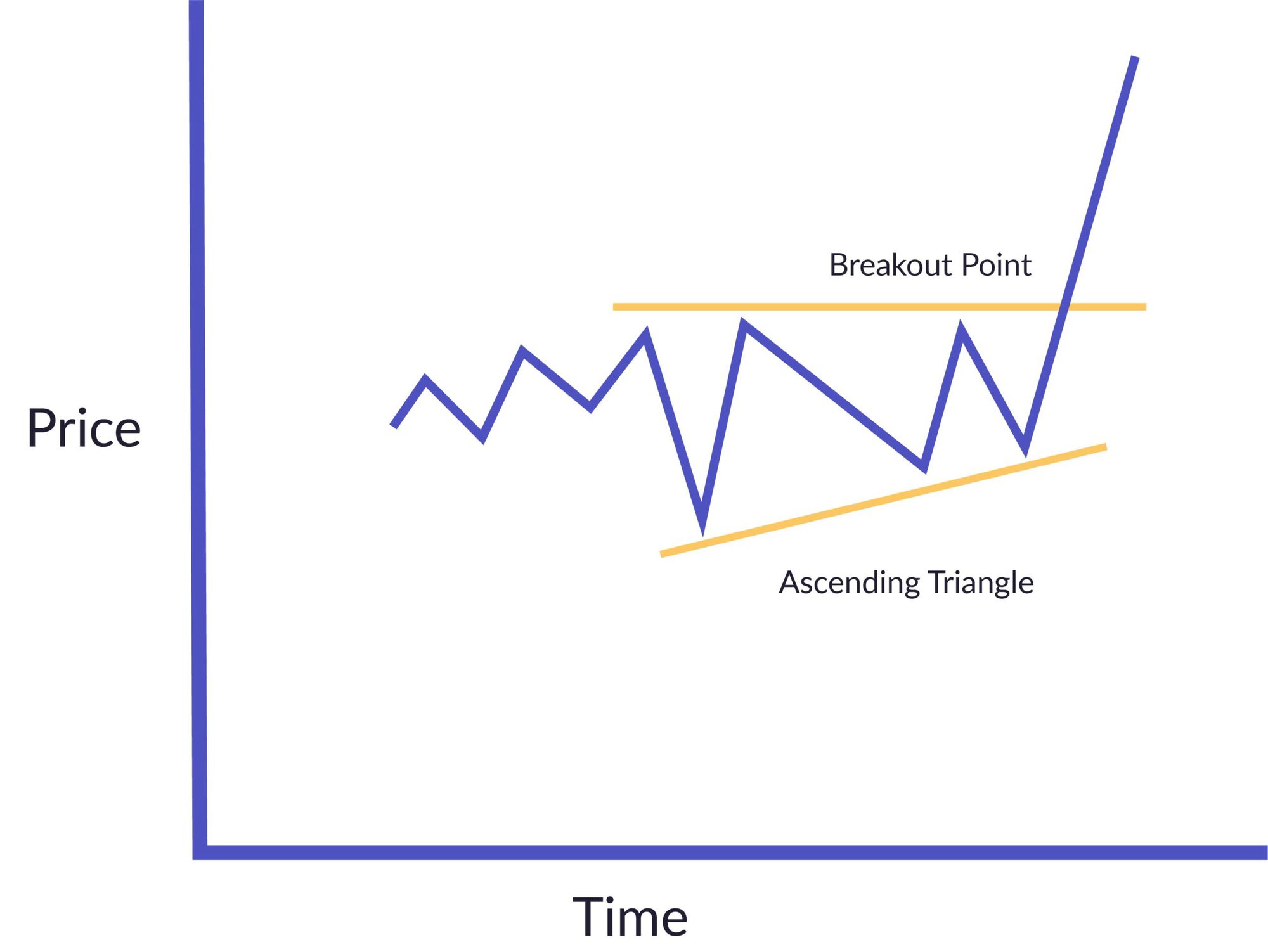
Example of an ascending triangle pattern[/caption]
Depending on whether the price outbreak takes place above the pattern or below, traders can perform long and short trades, respectively. Usually, traders will place the stop-loss outside the triangle facing the breakout point.
Descending triangles
A mirrored version of an ascending triangle is a descending triangle. It shows a bearish market with a downward trend. When found, it indicates that there might be a downward breakout and that shorting the stock can accelerate the devaluation of the stock.
Symmetrical triangles
Finally, a symmetrical triangle. When the upward and downward trend lines have a similar slope and start to meet, you’ll find these triangles.
The symmetrical triangle pattern indicates a consolidation period before the stock price goes up or down at the breakpoint. Often, the stop-loss for this pattern is right below the breakout point. Because of this, the symmetrical triangle can be a bit similar to pennants and flags.
Cup and handle
Another bullish continuation pattern is displayed in the cup and handle pattern. This pattern usually takes weeks or months to form.
[caption id="attachment_1768" align="alignnone" width="2000"]
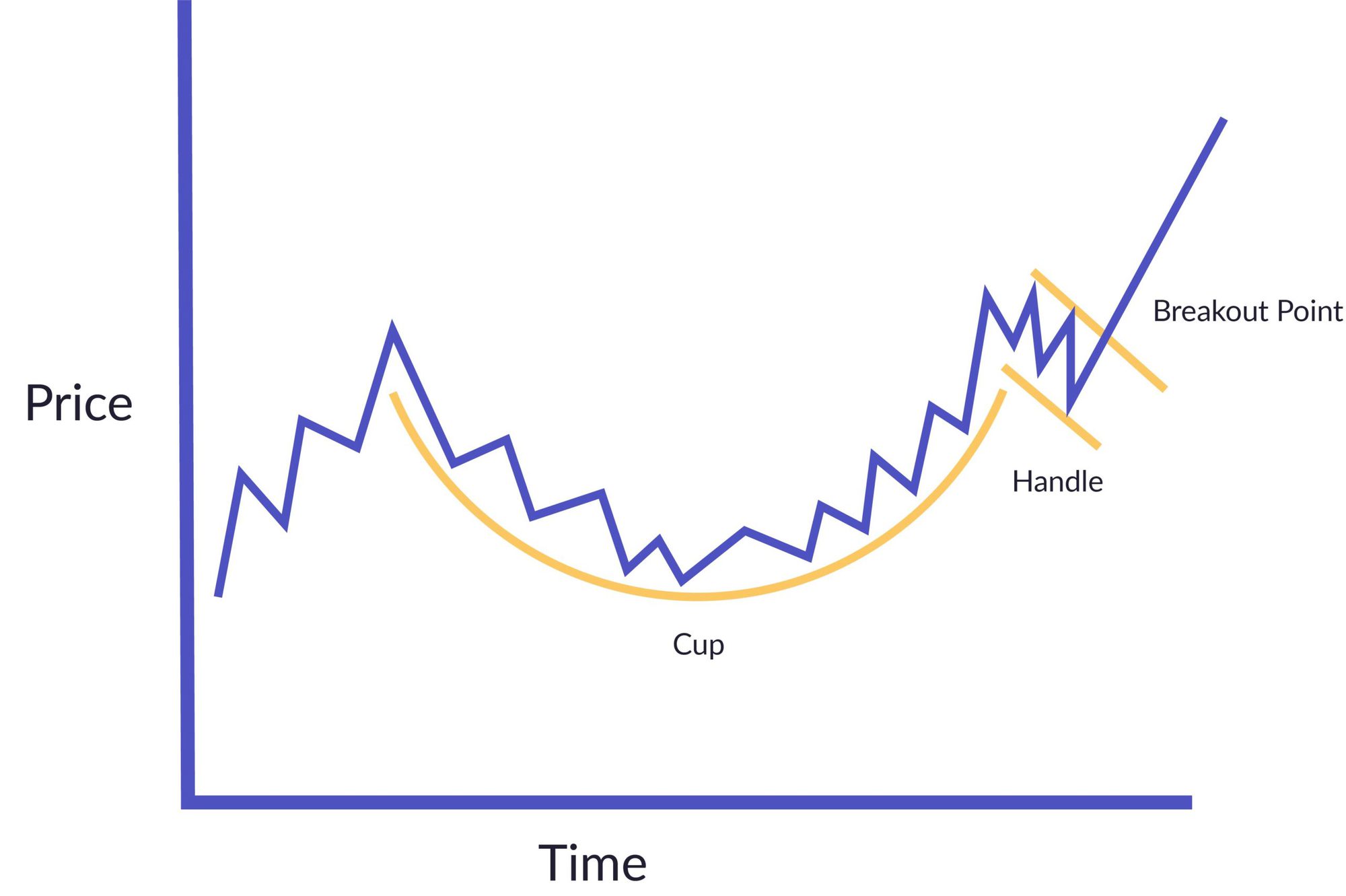
Example of a cup and handle pattern[/caption]
The shape starts to form when a price goes down and stays there for a while. After some time, the price rises again in a somewhat mirrored trend. Then the handle is formed.
Generally, a handle should be no longer than thirty percent of the cup. Because of its shape, stocks can close over the upper trend line (top of the handle), signalling the breakout point. This pattern is regarded as a more reliable pattern with a higher success rate for forex and stock data (65% and up). Shorter handles often have a higher chance of successful investing than those with a longer handle.
Rounding bottom
Where the cup and handle pattern happens when there is a low-trading volume, the rounding bottom is found at the end of a longer downward trend. The name of the shape tells you precisely what it looks like: a round bottom. It resembles the cup and handle but without the handle.
Similar to the cup and handle, the pattern can take time to form, but it’s also somewhat rare. The start of the decline signals an excess of supply, resulting in a decreasing stock price value, which attracts buyers, increasing the demand and price. This change indicates a market reversal and creates an upward momentum.
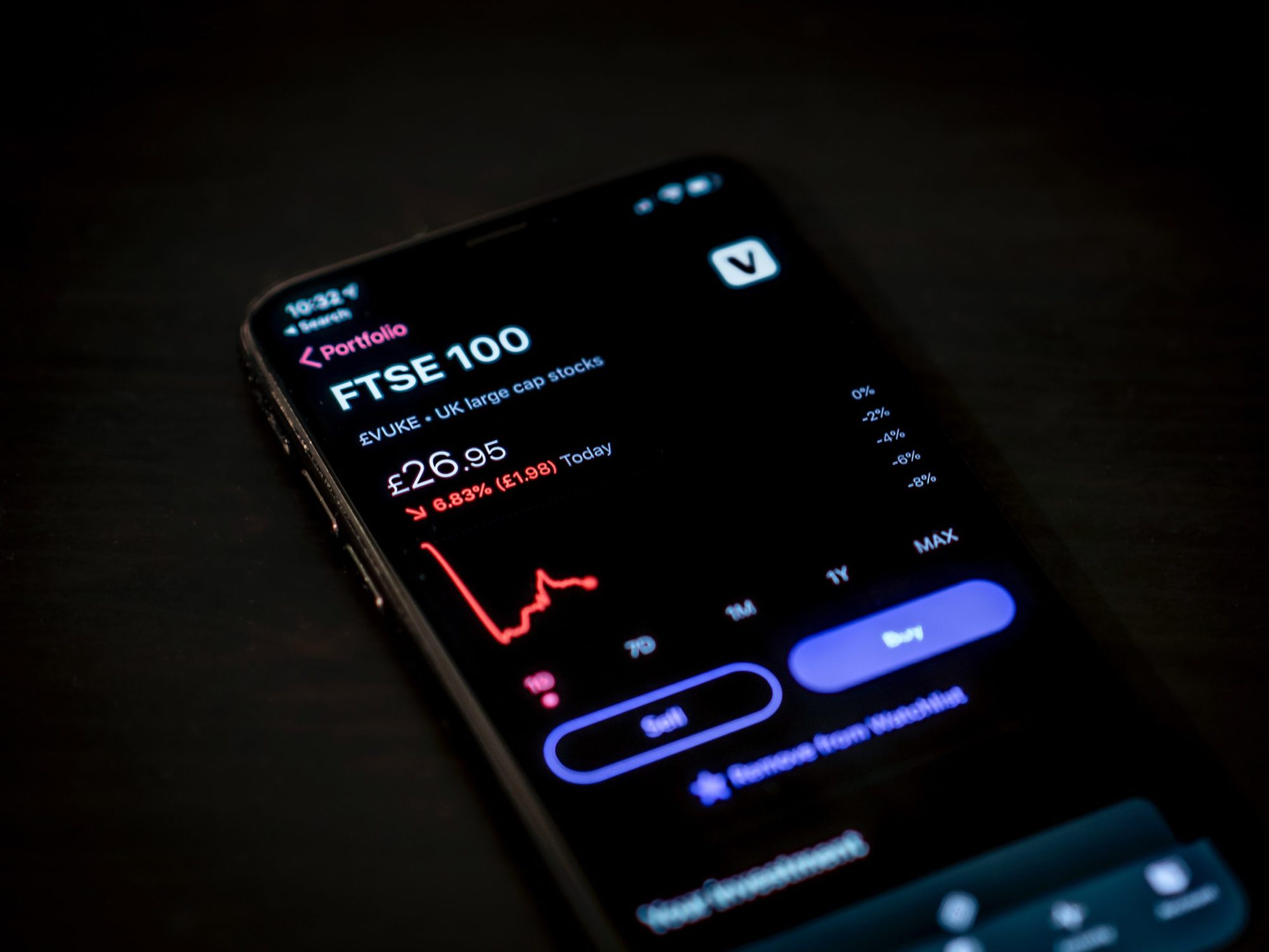
Every second counts in the world of finance. Investors rely on market data for accurate pricing information, and delayed market data can lead to unnecessary losses. Go for real-time market data instead!
Easily identifying patterns
There are many more stock trading chart patterns like wedges, triple top reversals, and head and shoulders, just to name a few. Fortunately, there is an easy way to correctly identify all of them to help you figure out when to buy and sell.
NetDania, one of our innovative fintech companies, offers a first-class financial charting tool that displays live forex charts with more than 2100 currency pairs as well as thousands of stocks, indices, and commodities.
The extensive chart API makes it possible to apply your own features, drawings, and menus, and it runs seamlessly on both mobile and desktop. It’s the perfect solution for market analysis at large corporations, forex market analysis at cash currency providers, and trade generation at prop trading desks.
Check out United Fintech’s charting solution for more details or book a personal, free demo with one of United Fintech’s experts to learn more about the cross-platform, high-end charting solution from NetDania.
Want to know about our mission? Here's a little bit about us and why we think fintechs and banks are made for each other.


Heading
We turn bold ideas into measurable results. By combining insight, execution, and technology, we deliver solutions that make transformation not just achievable, but repeatable.


